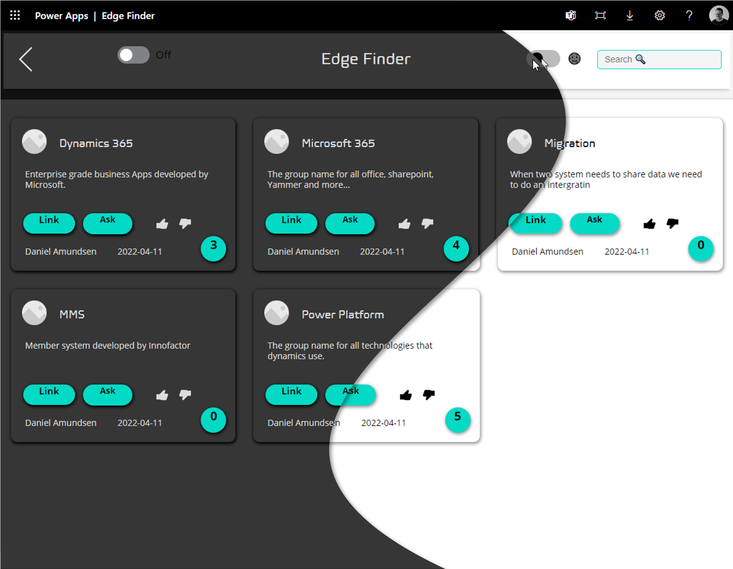
Almost any application worth mentioning has the option to choose light and dark theme as an end user. So in this article we will go through how to set this up in a new canvas app with just this. Why does it has to be a new canvas app? Because we will implement it using out of the box components that we modify using some variables and then we will have to copy and paste these components all around our application. I might cover in a future post how we would go about doing this on an existing, requires using visual studio code.
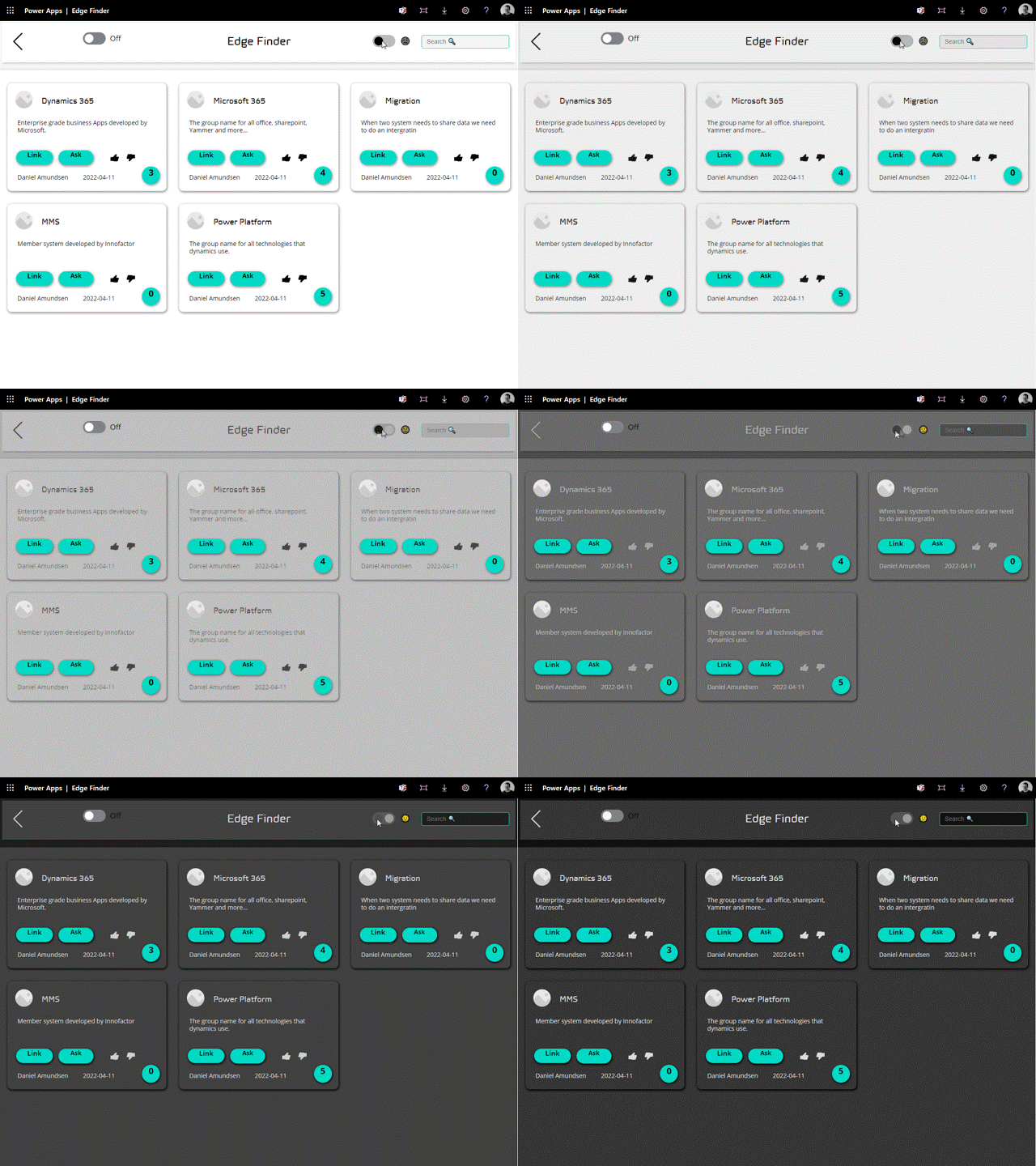
End result will look like this:
What we will cover
- App on start
- Creating a Theme Collection
- Using Material Design
- Implementing themes on controls
Creating the Variable on App On Start
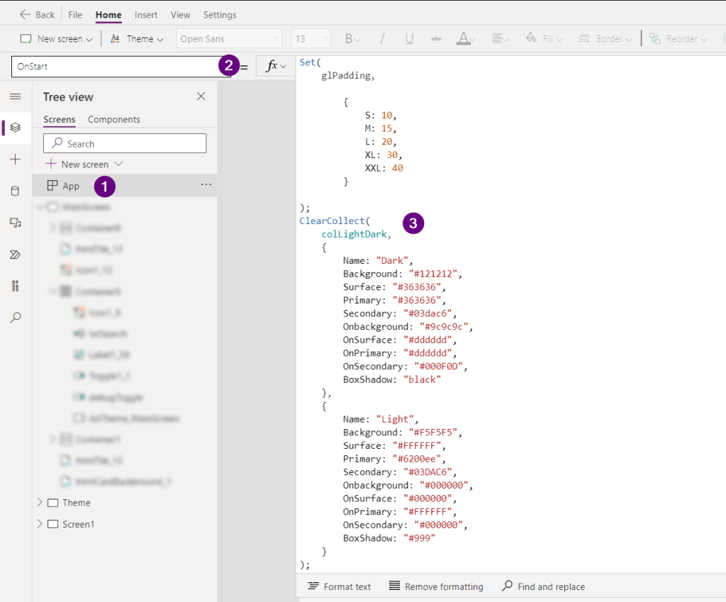
We need to have two states for our theme, light and dark, so for this we shall use a following formula.
ClearCollect(
    colLightDark,
    {
        Name: "Dark",
        Background: "#121212",
        Surface: "#363636",
        Primary: "#363636",
        Secondary: "#03dac6",
        Onbackground: "#9c9c9c",
        OnSurface: "#dddddd",
        OnPrimary: "#dddddd",
        OnSecondary: "#000F0D",
        BoxShadow: "black"
    },
    {
        Name: "Light",
        Background: "#F5F5F5",
        Surface: "#FFFFFF",
        Primary: "#6200ee",
        Secondary: "#03DAC6",
        Onbackground: "#000000",
        OnSurface: "#000000",
        OnPrimary: "#FFFFFF",
        OnSecondary: "#000000",
        BoxShadow: "#999"
    }
)
All the colors can be changed to match your own color scheme. If you want to create your own color scheme even if its not for creating a light and dark theme, then i suggest you create a screen like this.
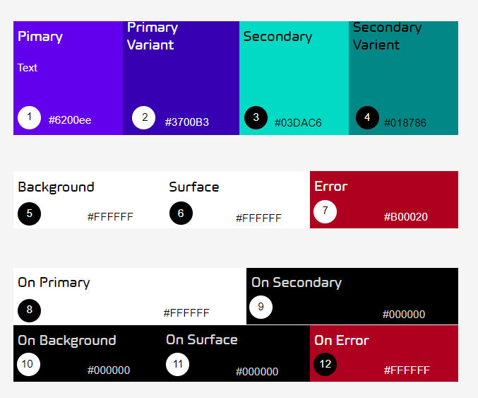
This way you get a clear picture of how everything will look together and using the app checker we can get notified on any accessibility issues we might have

Once we are sure that all will fit nicely together we can start modifying the standard components we have at our disposal. We assign the collection it self to a drop down and give the drop down a good name, I chose ddTheme. This we don’t need to style as it’s not ment to show.

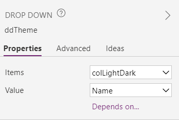
We also need a toggle control to make our selections. This control needs a Global varible as this toggle will be copied to many different places in our app, and with a global variable we can align all our screens theme just be pressing this toggle.
We need to:
- OnCheck attribute use this = Set(glThemeToggle, true)
- OnUncheck = Set(glThemeToggle, false)
- Default attribute = glThemeToggle


On the default property of the dropdown we need to have the following formula
//True and false correspond to the names we gave our themes when we created the collections
If(glThemeToggle,"Dark", "Light")
Editing our controls
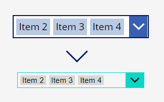
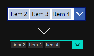
To achieve this we need to change all the color parameters of each control we want to use. For example the background color of out combo box

To give you a good start I opted to show many of the different places we need to change on a combo box
//Color
ColorFade(ColorValue(ddTheme.Selected.Onbackground),0%)
//Selection color
ColorFade(ColorValue(ddTheme.Selected.OnSecondary),0%)
//Hover color
ColorFade(ColorValue(ddTheme.Selected.OnSurface),-15%)
//Border color
ColorValue(ddTheme.Selected.Secondary)
//Fill
ColorValue(ddTheme.Selected.Background)
//Chevron backgroundcolor
ColorValue(ddTheme.Selected.Secondary)
ColorFade(ColorValue(ddTheme.Selected.Secondary), -15%)
//Chevron Fill
ColorValue(ddTheme.Selected.OnSecondary)
//Chevron hover Fill
ColorFade(ColorValue(ddTheme.Selected.OnSecondary),-15%)
//Pressed fill
ColorFade(ColorValue(ddTheme.Selected.Secondary),-25%)
Using what we built
What we now have achieved is a system that will allow us to easily copy and paste components that all have the theme implemented.
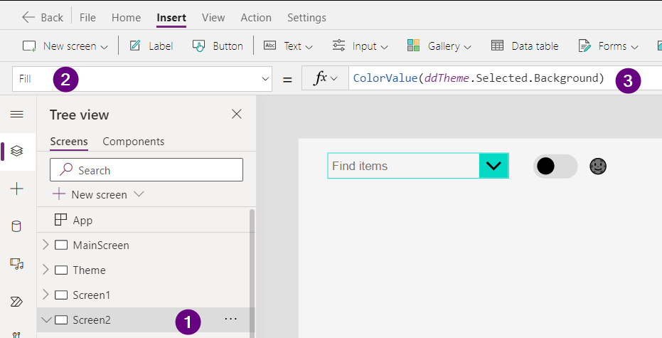
Create a new screen copy over the combo box we just modified, along with the toggle as well. Should look like this:

If you want you background to change as well, then use this formula here ColorValue(ddTheme.Selected.Background)
